Longitude is a luxury travel company that rents out high-end homes. They have homes for rent in Jackson Hole, Wyoming and Delray Beach, FL.
As the lead designer, I worked on various projects for Longitude such as company logo, two property logos, and website design.
The company describes itself as:
Longitude was born from our love of travel. For us, travel is a chance to create memories that will evolve our understanding of the world and shape the way our children look at daily life. We saw a missing link in the travel world – comfort and luxury without pretentiousness. Our homes provide privacy, an intimacy you only find within your own home.
Company Logo
The task involved designing a logo that reflected the company. My idea for the logo was to play off the of the company's name "Longitude". The lines of longitude appear vertical on a globe, with varying curvature but are actually halves of great ellipses. Also, I wanted to emphasize the verticalness and began the logo development by using typefaces that were bigger in length than width. I used black as the main typeface color with red and blue as accent colors as a starting point. I wanted the longitude designs to stand out from the globe. I used Adobe Illustrator to mockup all logos.
In the first row of logos at the top, I designed an ellipse to fit into the logo and then positioned it in various ways. In the second row, I used a globe design with the lines of longitude and used it again in various ways in the logo. In the third row, I used a more simplistic globe design with one line of longitude and also incorporated a compass design. In the last row, I experimented more with some previous ideas and then added a degree symbol, which is the angle where longitude is measured. I also used some different typefaces that were not longer than their width for variation. I sent these over to the account manager I was working with on this project. I thought these logos offered a good variety to start off with.
The account manager, the account coordinator, and the CEO (a former graphic designer himself) narrowed them down to the above three logos. Logo 1 used the degree symbol with a typeface that is longer than it is wide. Logo 2 used the ellipse in substitute for the letter "D" and used a typeface that is longer than it is wide. Logo 3 used the more simplified globe with a tilt adjustment and a typeface that is equal in length and width and kerned more widely than the other logo designs.
These logos were sent to the client for review. The client preferred the logo with the ellipse (Logo 2) but liked the spacing of Logo 3 and wanted to see a cleaner version of the logo with color options. The client did not want the word "properties" in the name anymore so that was eliminated from the logo design.
These were the three final concepts. I kerned all of the logos to give them a spacious look and used dark gray as the main color. The kerned letters reflected the luxurious Longitude properties which have tremendous space and comfort. Logo 1 used a thinner weight typeface that was longer than it is wide and the ellipse is purple, which is the color of royalty. Logo 2 also used a thinner weight typeface that was just slightly longer than it is wide and the ellipse is a blue-green color that is a mesh of the main two colors of the Earth. Logo 3 used a more futuristic-looking typeface that was longer than it is wide and the ellipse is gold, which is associated with wealth. These three logos were sent to the client for their final selection.
The client selected Logo 2. The sans-serif and rounded typeface gave the logo a modern, spacious, and high-end look to match the luxury brand feel of "Longitude".
Property Logos
The task was to design two individual property logos that reflected their unique personalities. My idea for the property logos was to play off the of the property's names. Silver Moose Chalet is their home in Jackson Hole, Wyoming and La Vie En Rose is their other home in Delray Beach, FL. I used Adobe Illustrator to mockup all the logos.
The mountain illustrations used for the Silver Moose Chalet logos were modeled after the mountains in Jackson Hole, WY. I also added a moose in two of the logos, which is in the property's name and is a popular animal seen in that location. I used a modern, slab-serif typeface for an outdoorsy feel.
The rose illustrations used for the La Vie En Rose logos emphasized the word in the property's name (there is a rose-patterned wallpaper in the home). I used thin, serif, and script typefaces for a delicate feel.
I sent the logos to the account manager and account coordinator and they didn't have significant changes for them. They were sent to the client for their final selection.
These two logos were selected by the client.
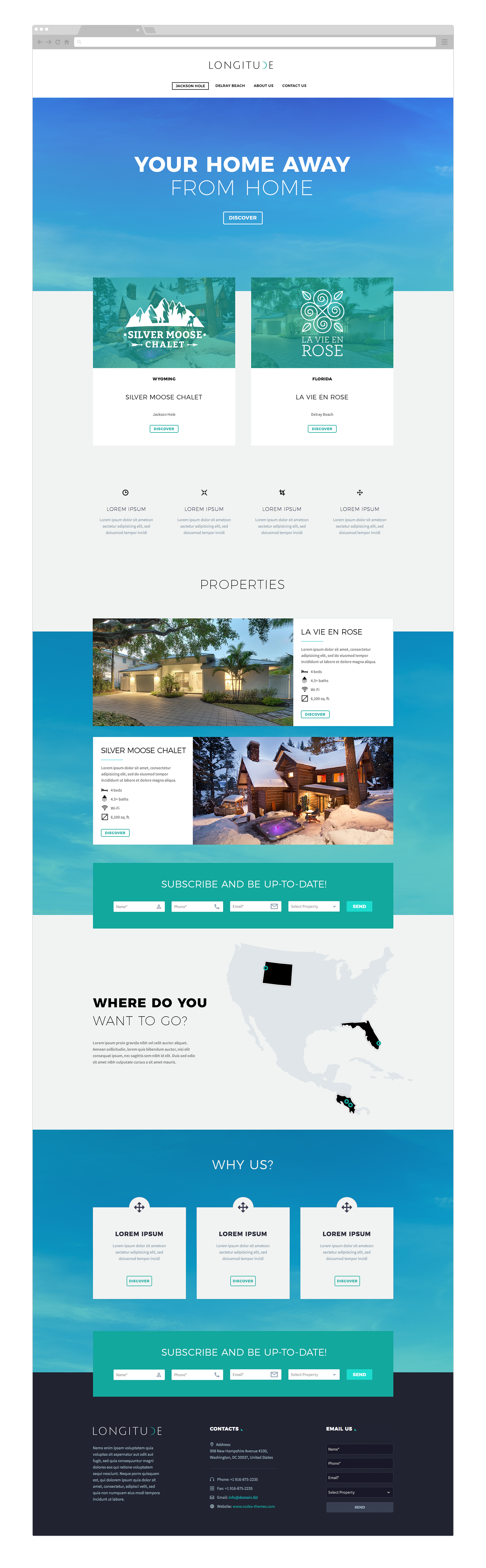
Website Design
The task was to design a website that reflected the company and it’s properties while making it user-friendly. I worked closely with the account manager, account coordinator, and web developer to choose a relevant WordPress layout. I also chose a color palette for the website that reflected and complemented the logo. I used Adobe Photoshop to mockup all website designs.
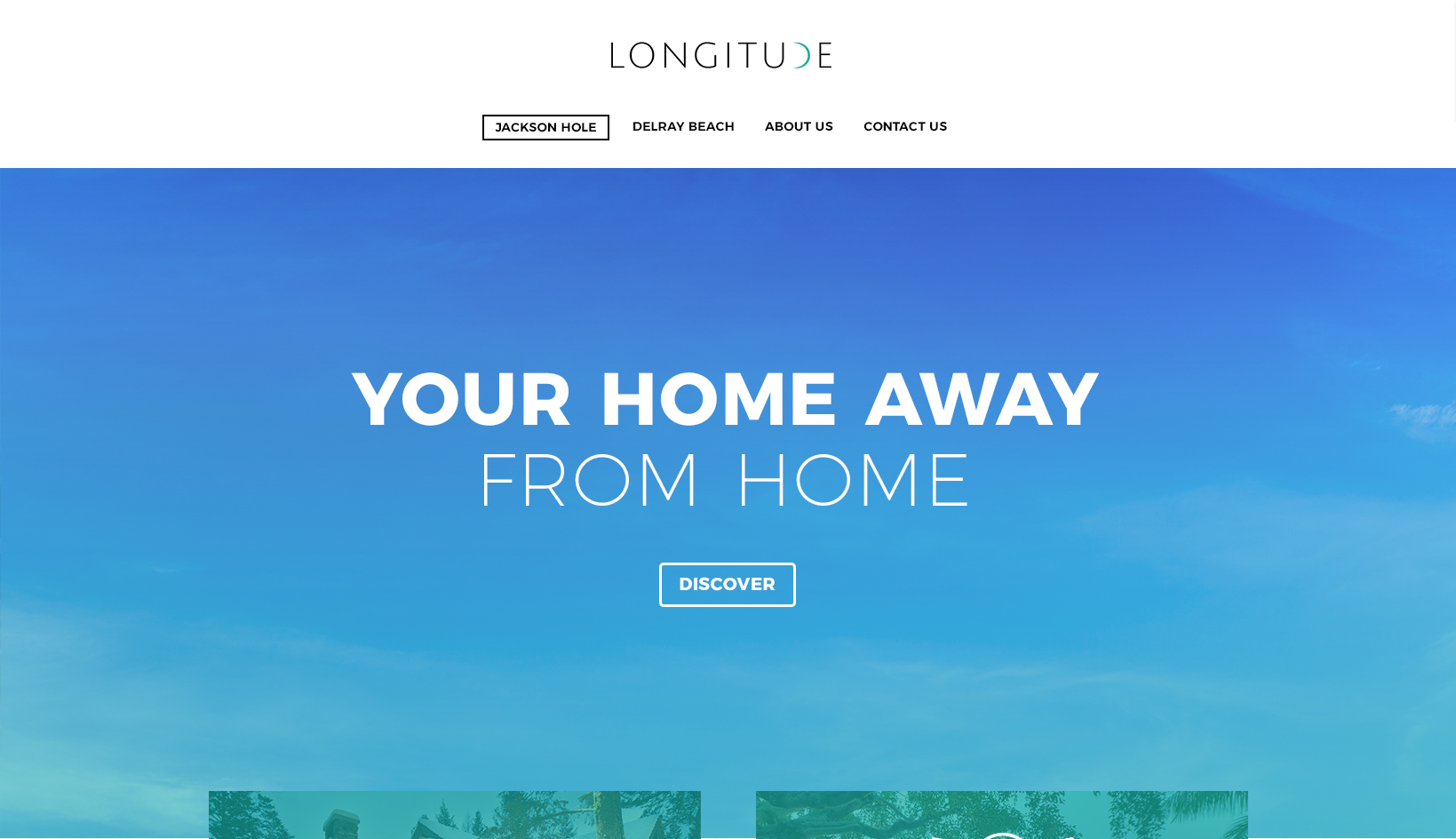
I chose sky imagery on the home page as a background to reflect the spaciousness and comfort of the properties, non-distracting from overlaying copy and images, and didn’t single out a specific property as there are multiple featured properties.

I featured the properties first: used the property logos overlaying their respective property images to closely associate them together.

I broke up the space between images with short copy blurbs.

I featured the properties again with description boxes.

I placed a call-to-action box so the user could easily contact the company after they learned about the properties.

I featured properties displayed on a map so the user could choose a property based on location.

I featured a section dedicated to three blurbs about different aspects of the company.

I placed another call-to-action box was used after the user discovers more about the properties and the company.

I used a big footer to feature a blurb about Longitude, the physical address of the company’s headquarters, other important contact information, and a quick email form.
Here is an overview of all the designed pages.