UX/UI Case Study: SOPO Bicycle Website Redesign

Contents
Overview
Team, Timeline, Problem Statement
Process
User Research, User Interviews & Key Insights, Define the Problem, Ideation, Information Architecture, UI Style Guide, UI Prototyping, User Testing & Insights
Key Takeaways
Future Opportunities
Overview
SOPO Bicycle Cooperative is a nonprofit, DIY bicycle repair shop based in Atlanta, GA that creates equitable access to cycling by providing no/low-cost bicycle maintenance services and education. SOPO’s services make transportation affordable, accessible, and sustainable.
Team
Our team consisted of three UX designers: Edgar Keiron Robinson, Alda Lee, and Allison Daly (me). We were highly collaborative in all aspects of the project and communicated very well. The roles of the project took shape organically. We were all involved in the user research process and had many discussions so that we were on the same page. Edgar and I were heavily involved in designing the user interface due to my background in graphic design and his natural talent for design.
Timeline
The timeline for the project was about two weeks. Our team had to complete everything from user research to working prototypes in a short time span.
We kept organized with Trello, a web-based list-making application that keeps you organized. We frequently discussed what we were working on and set milestones to keep us on track.
Problem Statement
The purpose of the project was to redesign the SOPO Bicycle Cooperative website.
We have observed through heuristic evaluation and competitor analysis that the existing sopobikes.org website lacked effective user interface design due to the unfinished look of the site, unorganized information architecture, repetitive content, and a poor hierarchy of information.
Users have financial limitations, but they need an affordable mode of transportation that will get them to their destination safely.
We found, during user and stakeholder interviews, that potential users may experience confusion regarding what a co-op is and what services the organization provides.
Stakeholders addressed issues with storage for their overfilled bicycle inventory, lack of funding, and they need volunteers to take on consistent & clear leadership roles for SOPO to expand.
How might we improve the user interface design of the sopobikes.org website to solve the problems the users and stakeholders are facing?
Process
User Research
Stakeholder contact:
We informed the stakeholders of our project and asked them if it was okay to conduct in-person user research at SOPO.
Heuristic evaluation:
We performed a heuristic evaluation to assess the pros and cons of the existing SOPO website.
sopobikes.org
Competitor analysis:
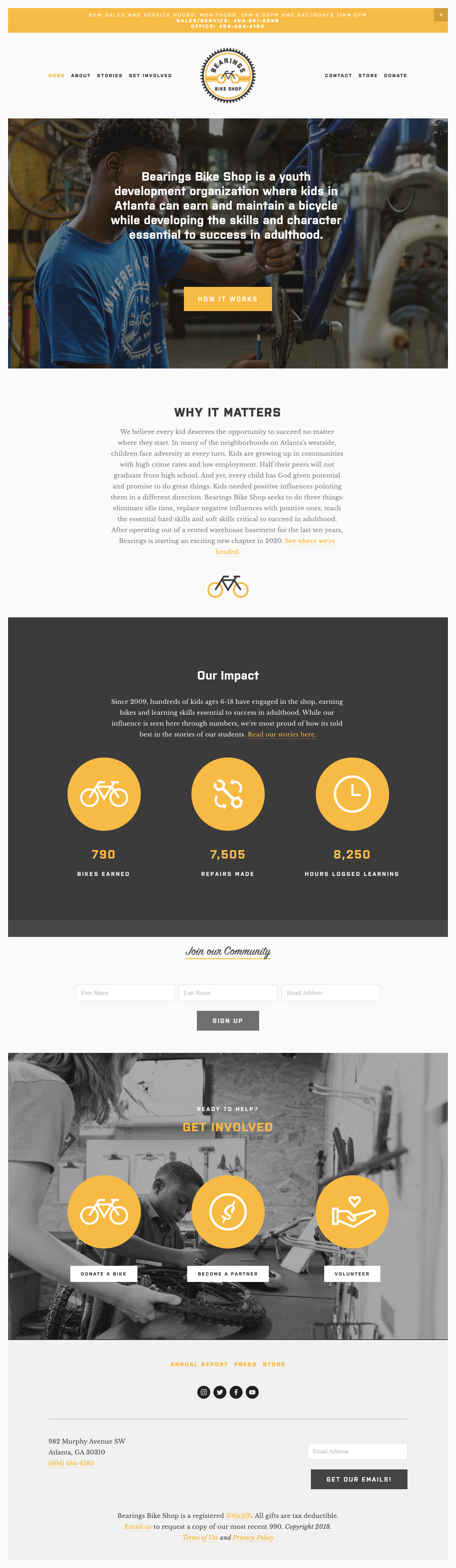
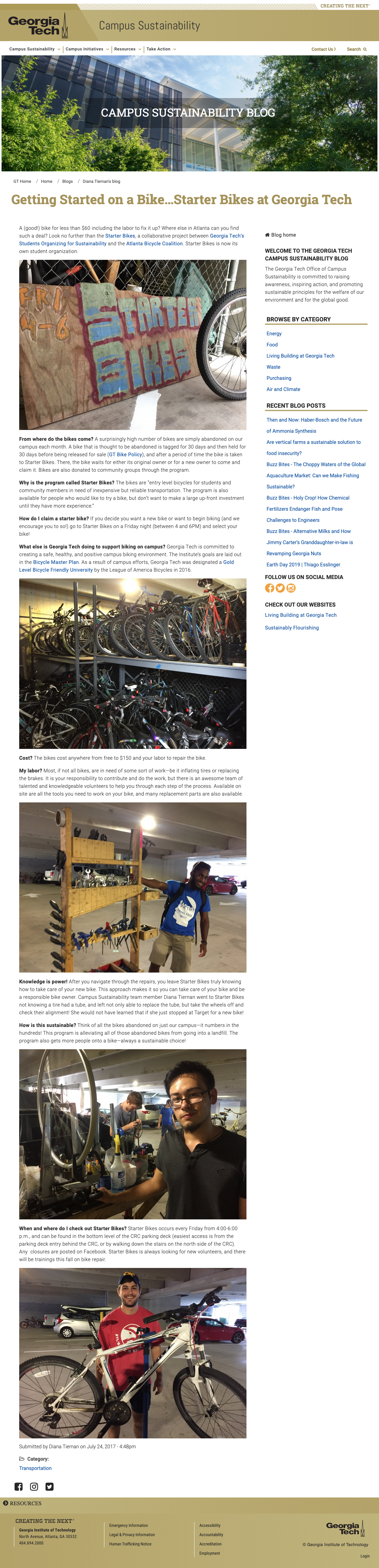
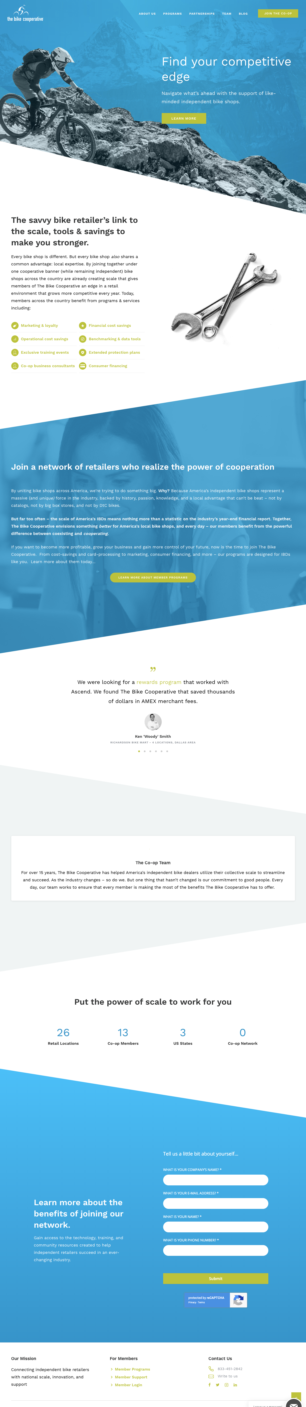
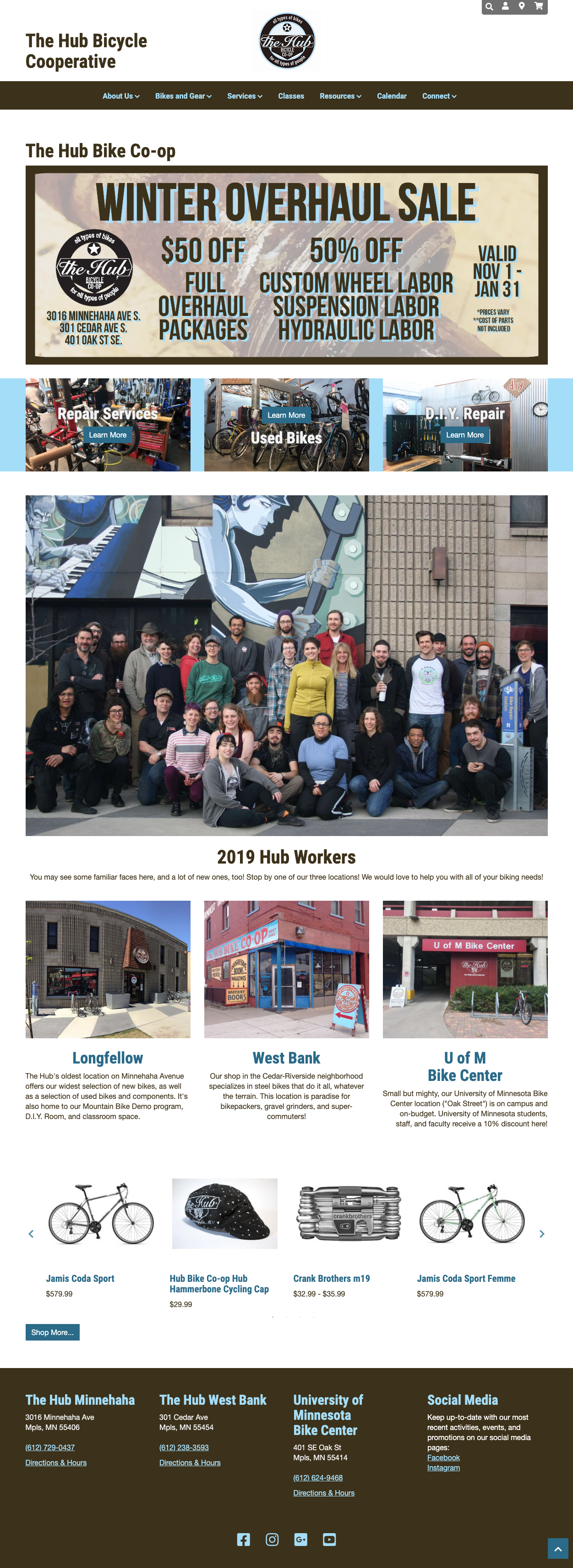
We analyzed four direct competitors: The Bike Cooperative , The Hub Bicycle Cooperative, Georgia Tech Starter Bikes, and Bearings Bicycle Shop.
Proto Persona (User): Herald Johnson
Proto Persona (Stakeholder): Scott Smith
User Interviews & Key Insights
We interviewed two users and two stakeholders.
User Interviews:
One user doesn’t have much money, accesses the internet in the library, doesn’t own a phone, doesn’t use social media, but likes YouTube
One user visited the SOPO website for their address & phone number
One user said that SOPO is excellent for learning, it has positive energy, they like to help, it’s useful for preventing additional auto traffic, and it is essential to Atlanta
One user had three bikes stolen, has health issues, weary of government invading privacy, and likes to stay healthy
One user said they want to get home safely
Users love biking
One user is a former volunteer and volunteered through their high school years at SOPO
One user had a bad experience at Outback Bikes (competitor), and they had terrible reviews
Stakeholder Interviews:
People don’t know what a co-op bike shop is (they said it is more of a non-profit than a co-op)
People think SOPO is a typical bike shop
They receive bike donations
Funded only by donations
Their online presence is mostly through social media
They think their website provides enough explanation
They don’t respond enough to people online
They like giving back to the community, love biking, helping one another, unity, helping kids, access to bikes, and having the tools & knowledge for fixing bikes
They make a minimal profit, have a lack of funding, and too many bikes were donated that they don’t have space for
They have a fear of growth because they need better management and more people to take on more responsibilities, they all have different expectations rather than one clear common goal
They’ve relocated a lot; since they’ve moved, they’ve had a reduction in foot traffic
Many volunteers are former customers
Affinity Diagrams:
We used Miro, team collaboration software, to create and share our affinity diagrams. We also used it for our empathy maps, business model canvas, and ideation methods.
User Affinity Diagram
Stakeholder Affinity Diagram
Empathy Maps:
User Empathy Map
Stakeholder Empathy Map
User Insights:
During heuristic evaluation and competitive analysis, we discovered that the website is lacking an effective user interface design due to the unfinished look of the site, unorganized information architecture, repetitive content, and poor hierarchy of information.
During user & stakeholder interviews, we discovered:
Potential users may experience confusion regarding what a co-op is, and what services the organization provides
Users have financial limitations, but they need an affordable mode of transportation that will get them to their destination safely
Stakeholders addressed issues with storage for their overfilled bicycle inventory, lack of funding, and the need for volunteers to take on consistent & clear leadership roles for SOPO to expand
Therefore, we believe that by redesigning the sopobikes.org website, we might be able to help alleviate some pain points by providing enough information on the website for users.
We might do this by explaining what SOPO is and the services they provide, emphasizing the sales of bikes, explaining why SOPO is affordable for all, collecting donations, and emphasizing the importance of the project leadership role when volunteering.
Doing this will allow the website to provide more useful information to users, increase the number of donations, increase access to bicycles for those who can’t afford it, decrease the volume of bike inventory, and increase the awareness of the importance of project leadership.
Define the Problem
Value Proposition Statement:
Our group is redesigning the sopobikes.org website to inform potential customers what a co-op is and what services SOPO provides, increase donations, increase access to bicycles for those with financial burdens, decrease SOPO’s overfilled bike inventory, and increase the urgency of volunteering for project leadership.
Why SOPO is better:
Established community, no/low-cost maintenance service for bikes, access to affordable bikes, education.
Why we’re believable:
We educate you on how to fix your bike so you can gain a skill for life.
“Discover your direction. Discover your bike.”
Business Model Canvas:

Ideation
UX Scenario & User Journey Map:
Storyboard:
Ideation Methods:
I Like, I Want, I Wish
Feature Prioritization Matrix
Information Architecture
Card Sorting:
We card sorted with three volunteers to understand better where users would look to find information on the site’s navigational structure.
Before Card Sorting
User 1 Card Sorting

User 2 Card Sorting
User 3 Card Sorting
Sitemap:
We analyzed the similarities and differences from all of the volunteers and developed a sitemap.
User Flow:
We diagrammed the user flow of making a donation.
User Interface (UI) Style Guide
Inspiration:
Style Tile:
Animations:
We used Adobe XD for animations.
User Interface (UI) Prototyping
Paper Prototypes:
Mobile Home Page, Sections 3 & 4
Mobile Home Page, Sections 1 & 2
Desktop Home Page, Section 1
Desktop Home Page, Section 2
Desktop Home Page, Section 3
Desktop Home Page, Section 4
Low Fidelity (Lo-Fi) Prototypes (Desktop & Mobile):
We used Adobe XD for prototyping.
Mobile Home Page
Mobile Menu & Donate
Desktop Menu & Donate
Desktop Home Page
High Fidelity (Hi-Fi) Prototypes (Desktop & Mobile):
Mobile Home Page
Mobile Menu & Donate
Desktop Home Page
Desktop Menu & Donate
User Testing & Insights
Lo-Fi Prototype Testing & Usability Analysis:
Users found the donation field forms small on the desktop but a good size on the mobile
One user could not complete the donation form
Users found the contact information easy to find in the footer but also tried to look under the About section, which brought up a good idea to put a contact link under it
Users found it easy to find and search the volunteer page.
A user did not know at first to scroll down the page on the desktop.
A user found the contact information on the mobile to be small
Hi-Fi Prototype Testing & Usability Analysis:
Users said: clean design, enjoyed images, enjoyed icons, pleasing color scheme, and was still easy to navigate.
Key Takeaways
Future Opportunities
Build out a bike shopping page where users can see the bike’s inventory of bicycles so SOPO can sell more bikes and reduce their inventory.
Fix all user complaints by adding a Contact page under the About section, adjusting form fields and font size on the donation page on desktop, contact font size on the mobile, and building out all pages.
More testing, more iterations.
Build out more user animations like hovering on the desktop for a more exciting interactive experience.