UX/UI Case Study: Streamify Mobile App
Contents
Overview
Team, Timeline, Problem Statement
Process
User Research, User Interviews & Key Insights, Define the Problem, Ideation & Brainstorming, UI Style Guide, UI Prototyping & User Testing
Key Takeaways
Future Opportunities
Overview
Streamify is a mobile application that helps users easily find movies and television shows across all available streaming platforms.
Team
Our team consisted of three UX designers: Jonathan Kaplan, Niles Ruf, and Allison Daly (me). Since I already have a lot of experience with user interface design I wanted to challenge myself by focusing more of my efforts on user research along with Jonathan. I assisted Niles in the user interface design by quickly designing a logo and helping build out the high and low-fidelity prototypes.
Timeline
The timeline for the project was about two weeks. Our team had to complete everything from user research to working prototypes in a short time span. We kept organized with Trello, a web-based list-making application that keeps you organized. We frequently discussed what we were working on and set milestones to keep us on track.
Problem Statement
Streamify was designed to achieve a more streamlined and enjoyable experience when looking for a TV show or movie, taking into account multiple streaming subscriptions and personal preferences. We have observed, through user interviews and surveying that streaming services lack fundamental organization and features necessary to make choosing something (in a sea of choices) quick and effortless. This creates frustration in users because they might spend a long time choosing what to watch rather than just watching it.
How might we build Streamify so that our users are successful based on user testing, user preferences, and previously analyzed data?
Process
User Research
Competitive Analysis:
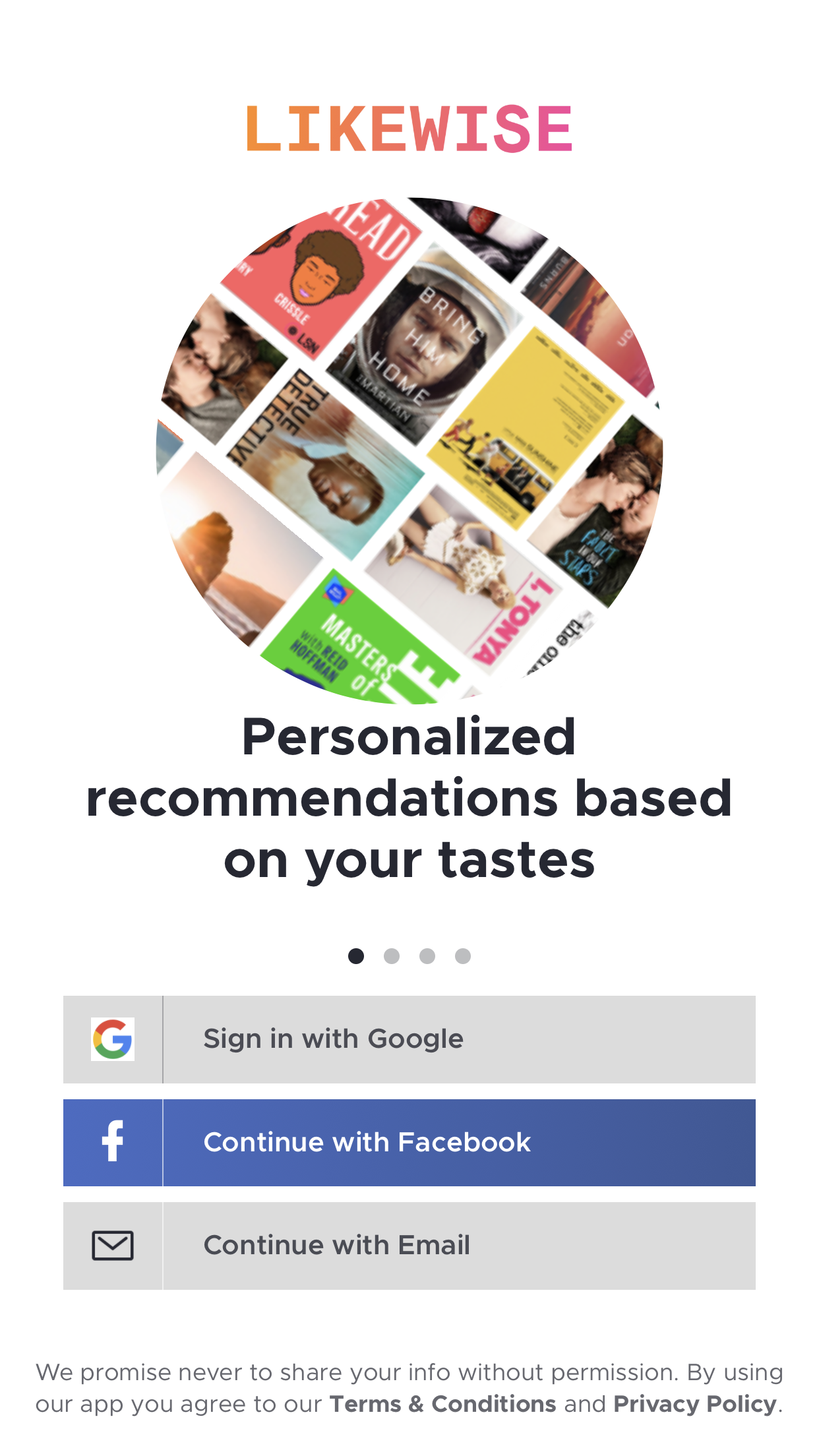
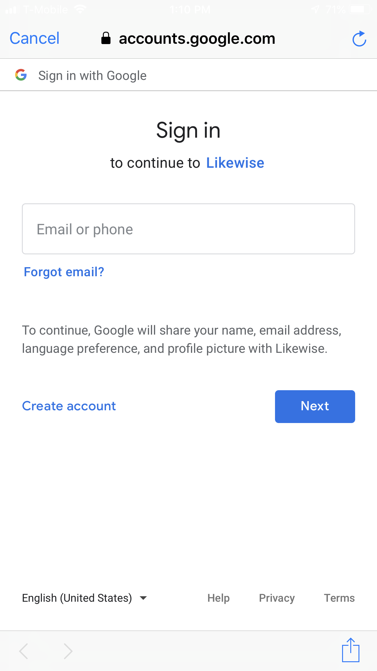
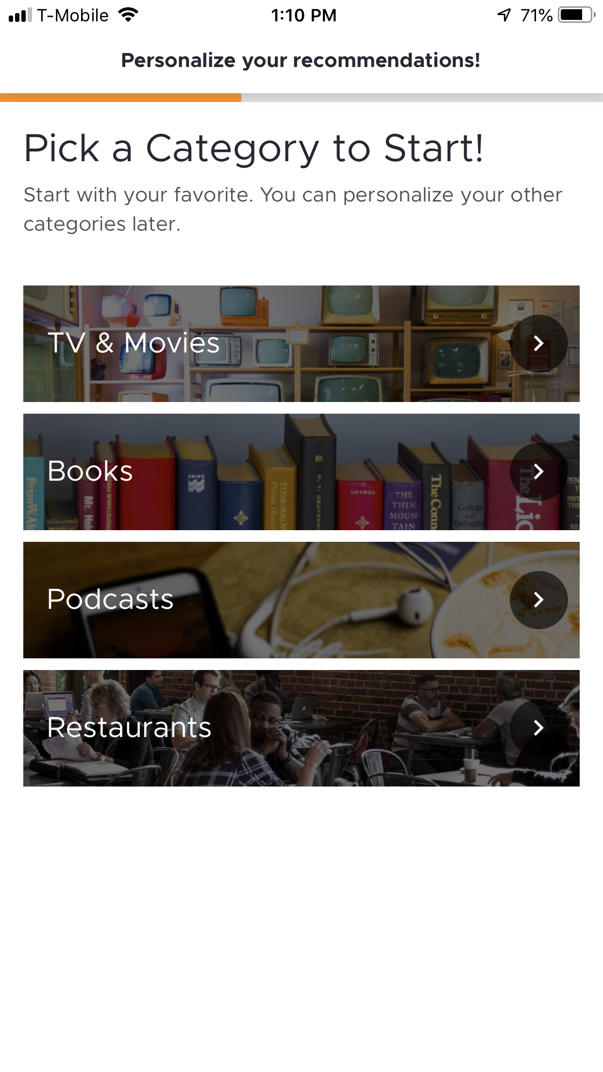
Our group conducted an analysis of other streaming consolidation apps to see what we might be competing with. Reelgood and Like Wise are examples of these competitors. While some of their designs and functionality are really well done, there are aspects that could be heavily improved upon. We further analyzed these apps to see exactly what we can do better and set out to do just that.


Heuristic Evaluation:
We analyzed the functionality and features of existing apps to ensure proof of concept, market viability, and how to improve upon our competition.
User Interviews:
To further understand the behavior of potential users on a more fundamental level than what surveys can achieve. Interviews were flexible in questioning and follow-up questions were made in consideration of previous answers. Gain more personal information about behavior and preferences when it comes to streaming platforms and how they consume content.
Insights:
n=5
100% of respondents find it difficult to know what platform content is on
80% of respondents decide what to watch with other people present
80% of respondents decide what to watch based on word of mouth
60% of respondents want to know if the movie/show will be worth their time
What we found with all of these insights is that people trust their friends and family above all, multiple opinions need to be taken into account when deciding, and people are concerned if what they watch will be WORTH it, not to mention the confusion of what show or movie is on what platform.
User Surveys:
Constructed to gain valuable feedback on real users and their behavior/preferences.
Results:
n=146
Insights:
All screen sizes are used to a significant degree.
The normal curve helps reinforce our claim by showing a truly random sample, slightly weighted towards the left.
Aside from that, of 146 respondents, only 6 people didn’t use streaming platforms, with the national average for US adults being 62%.
26.6% of responses indicated that word-of-mouth is a priority decision maker
25% of responses indicated content saturation issues or indecisiveness
12.2% of responses indicate there isn’t anything “good” to watch
Important to note that the respondents had the option to include more than one answer, so average responses per question=164.
That being said, we found that when deciding what to watch, word of mouth is incredibly important
Also found that people have issues with content saturation and indecisiveness when making decisions on what to watch.
12.2% (~20 people) indicate that they don’t have anything “good to watch” which, to me at least indicates that their streaming platforms aren’t catering to their needs, algorithms aren’t “reading” them properly and it creates a disconnect and a fundamental issue within looking through hundreds of titles, very few of which are “good enough”.
Learning Opportunity:
A mistake we made, and learning experience, when conducting the survey was not giving more multiple-choice questions. We could have made educated guesses of what users would say and had them pick out responses and give an ‘other’ option as a backup. We had to comb through all of the respondents’ answers and categorize them. This took a lot of time due to so many responses.
Affinity Diagram:
Empathy Map:
User Persona:
After collecting all our user data and organizing it into an affinity diagram and empathy map, building a useful user persona and scenario was fairly straightforward.
Key Insights
During user research (interviews and surveys), we discovered that most users find it difficult/frustrating to search for movies/tv to watch and on what platform movies/tv-shows are streaming. Half of the users think there is too much content and streaming service choices. Furthermore, a substantial amount of users want all of their movies/tv-shows on one central platform. In conjunction with these findings, a majority of responses indicated that they view movies/tv based on word of mouth.
Therefore, we believe that users are experiencing frustration with how streaming platforms organize and display content and that we might be able to help if we create an app that consolidates movies/tv-shows across all streaming platforms with accurate descriptions and aggregated reviews.
We might do this by creating a:
Efficient and detailed filter list
Display what “friends are watching”
Notify content changes on each subscribed platform
Detailed and modular home page, allowing for personal preference and recommendations based on an assortment of crowdsourced opinions
Mark as seen function to eliminate previously watched or unwanted results
Doing this will allow Streamify to be the best way to find what users want to watch when they want to watch it, and on what platform they can find it, not only streamlining the user experience of streaming platforms but also creating a new way to discover and find the best shows and movies for each user.
Define The Problem
Problem Statement:
Streamify was designed to achieve a more streamlined and enjoyable experience when looking for a TV show or movie, taking into account multiple streaming subscriptions and personal preferences. We have observed, through user interviews and surveying that streaming services lack fundamental organization and features necessary to make choosing something (in a sea of choices) quick and effortless. This creates frustration in users because they might spend a long time choosing what to watch rather than just watching it.
How might we build Streamify so that our users are successful based on user testing, user preferences, and previously analyzed data?
UX Hypothesis:
We believe creating our streaming service aggregator for consumers with multiple subscriptions will assist them in making well-informed decisions with ease & satisfaction.
Value Proposition:
Netflix, Hulu, Prime Video, etc., subscribers of those streaming services frequently overlap and struggle with balancing everything available on each service. Therefore, Streamify came about as a solution to content saturation in an internet landscape full of media to consume but completely lacking in any organization or curation. We have built a system that not only consolidates all of a user’s subscriptions but is also highly personalized based on what your social circle watches, what they recommend, your favorite actors, directors, etc., and even specific moods you can define yourself. We’re believable because every decision we make is informed by data from real users.
Ideation & Brainstorming
Feature Prioritization Matrix:
We informed the stakeholders of our project and asked them if it was okay to conduct in-person user research at SOPO.
User Scenario & Journey Map:
We informed the stakeholders of our project and asked them if it was okay to conduct in-person user research at SOPO.
Storyboard:
We informed the stakeholders of our project and asked them if it was okay to conduct in-person user research at SOPO.
Information Architecture
Card Sorting:
We decided to do card sorting a little differently.
Jonathan came up with the brilliant idea of using card sorting for the home screen to find out what categories users would like to see on the home screen.
We came up with 15 categories and had users rank them from most interesting to least interesting.
The card sorting helped us narrow our home screen down to 5 categories, with the number one category being “New Releases of Movies/TV Shows”.
New Releases of Movies/TV Shows
Because You Watched This Movie/TV Show, We Recommend You Watch This Movie/TV Show
Movies/TV Shows That Match Your Mood
Movie/TV Shows That Are Trending
Movie/TV Shows Starring Your Favorite Actors/Actresses
Task Flow:
Our first step was using the scenario to break down the task flow of a new user.
The main functionality is built on tailoring an experience based on your movie/tv watching preferences and your close friends’ preferences because research clearly showed word-of-mouth was huge.
I will say, it’s not meant to be a social media… it’s as much of a social platform as Spotify is.
Needless to say, the search page we put together had to have a really thorough selection of filters to help users quickly narrow their choices with some precision.
User Interface Style
Logo:
We are streamlining the streaming process so I came up with the name Streamline. Jonathan came up with Streamify and we all agreed we liked the sound of that more. I brainstormed related descriptive words of streamline: modernize, organize, compose, connection, bridge. This led me to choose a cursive font to represent the ease of the continuous flow (stream) of the app. I curved the words to represent how our app “bridges” the gap between searching for what to watch and where to watch it. The play button represents playing movies and shows, located in the bottom curve of the “S”.
Style Tile:
We figured out early on that a dark UI design would be our preference. It seemed reminiscent of a cinematic experience and we assumed our typical user might be using our app in a dark room often.
Nile started by doing a lot of research into design methods for a Dark Mode. He looked at Apple’s Human Interface Guidelines, which I was already familiar with but Jonathan suggested I explore Material Design, Android’s design guidelines developed by Google and it was really good.
Nile created two color palettes based on some hues that he thought would contrast a dark theme uniquely - in a way he hadn’t seen in any UI design he uses regularly but still felt familiar and nostalgic. The peach to purple gradient he thought conveyed warmth and excitement while the turquoise to the near royal blue seemed calm and cozy.
So with those color palettes in mind, Nile added the gradient to the logo and also thought personalizing the black background for our brand by adding the very faint gradient to it would be cool. Even though the bright colors ended up being used more than not, he also broke down the shades of grey we should use to create a sense of elevation between different elements.
Nile suggested the peach be used for all buttons because it popped and was a good color for a Call To Action element. And finally, he knew he wanted the font to be some kind of Sans Serif because they’re generally clean, organized, and inconspicuous but still elegant. Nile found Open Sans while browsing Google Fonts… it was very unassuming but, again, very elegant - it just caught his eye…
Prototyping
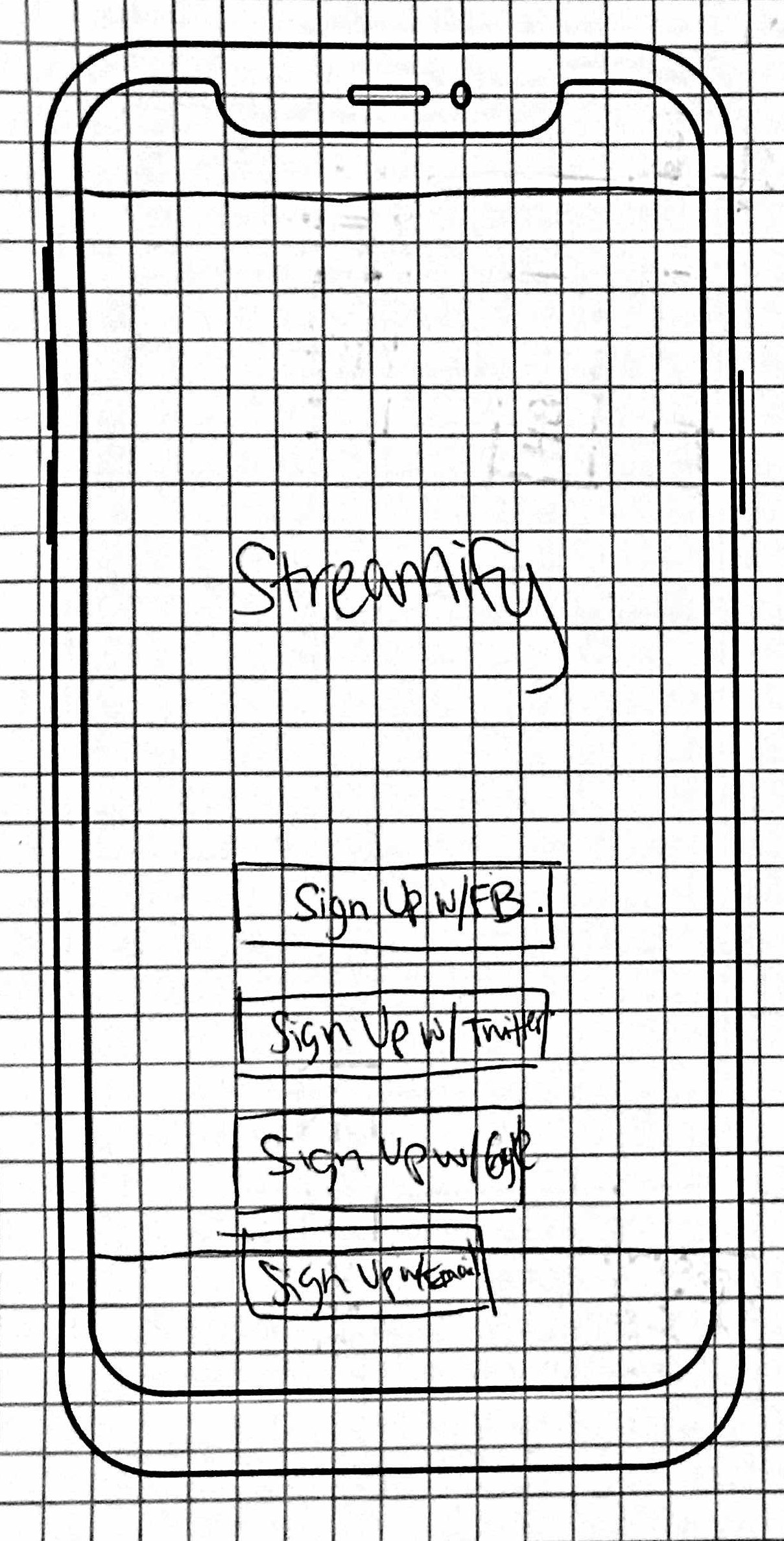
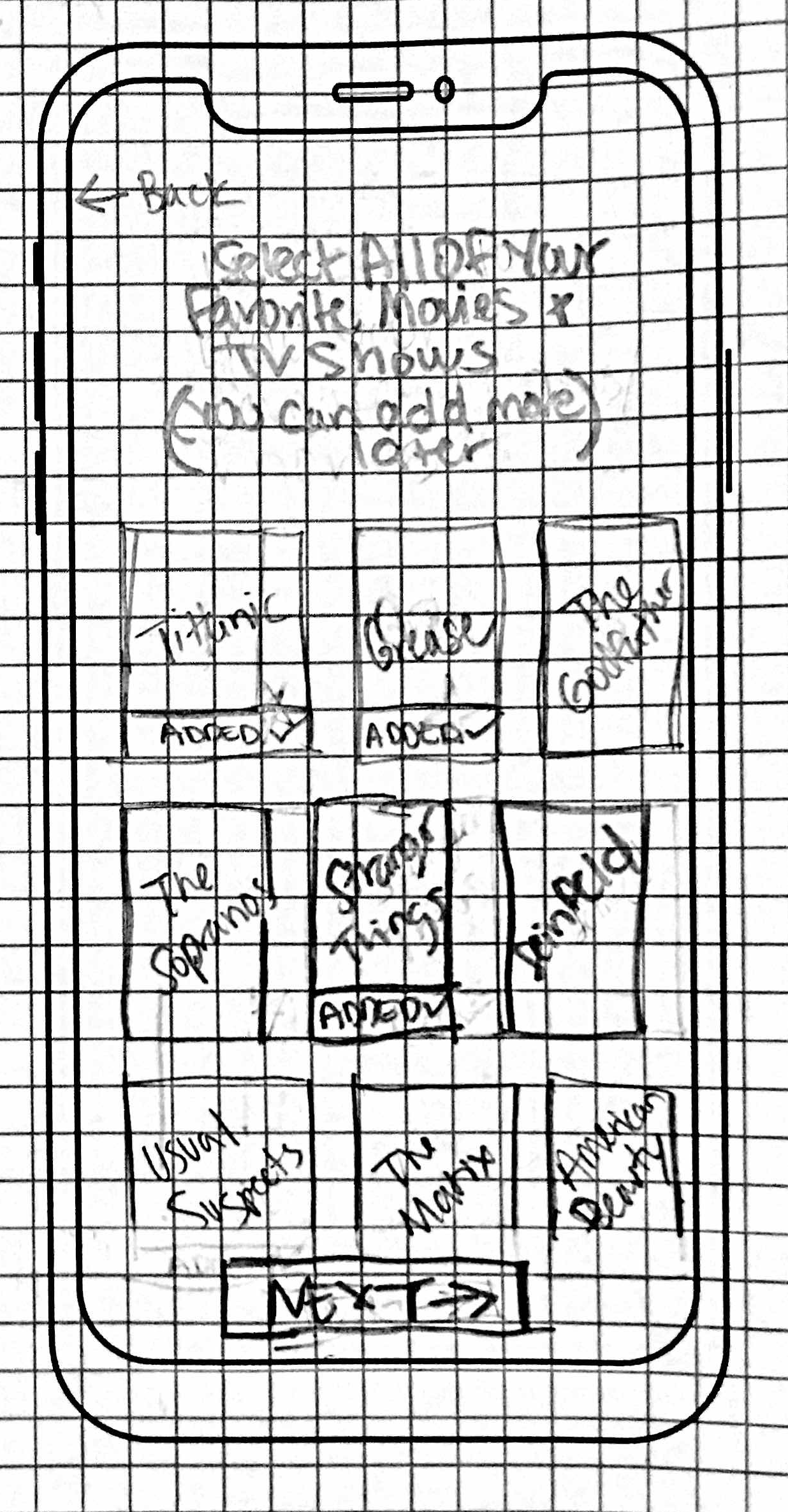
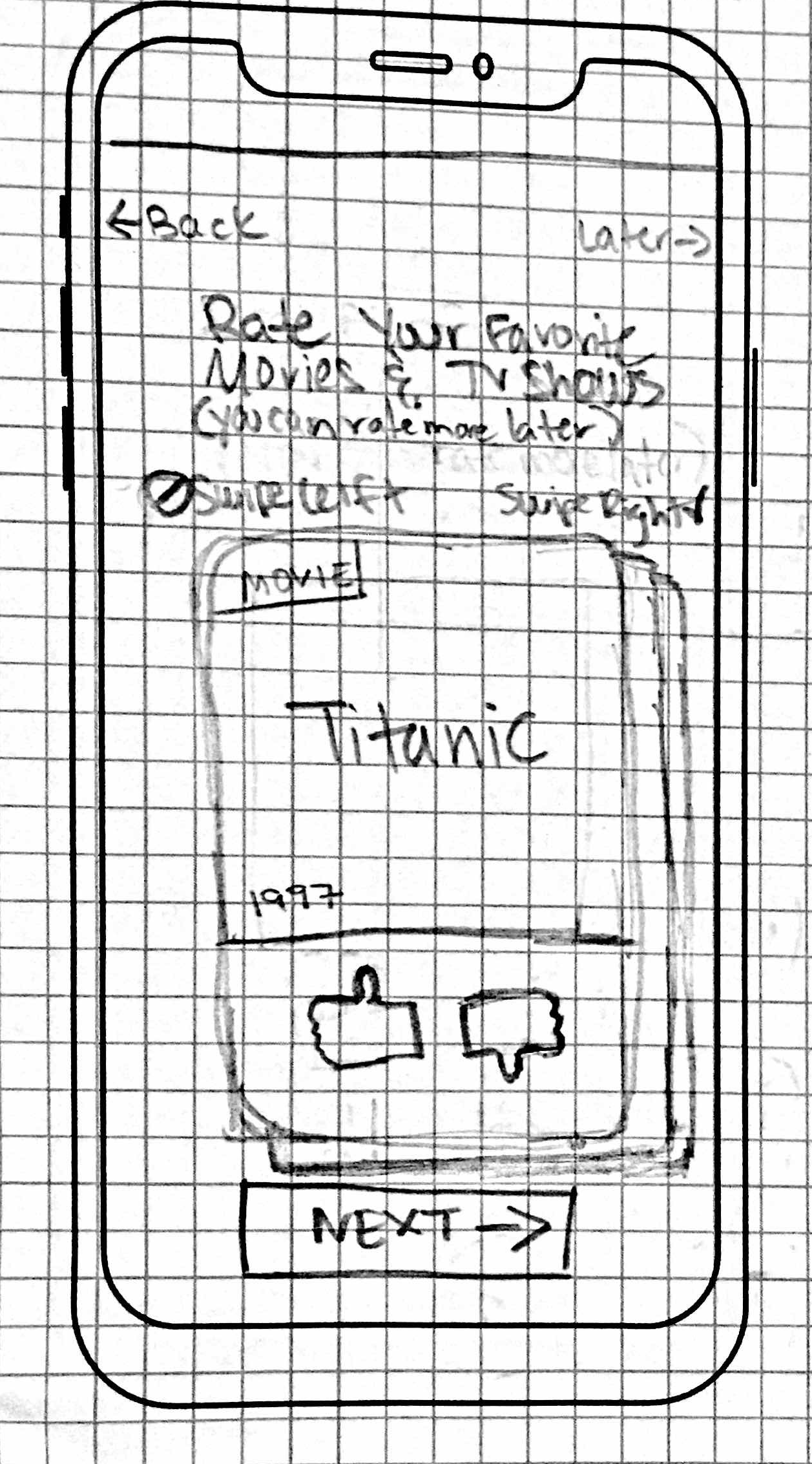
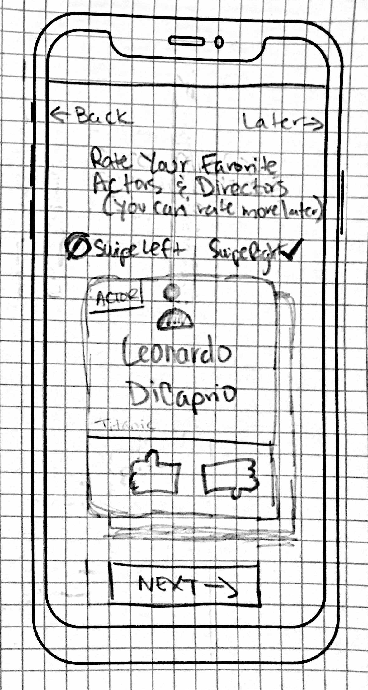
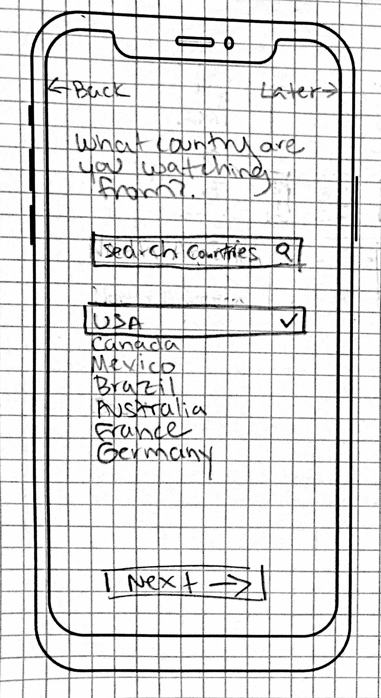
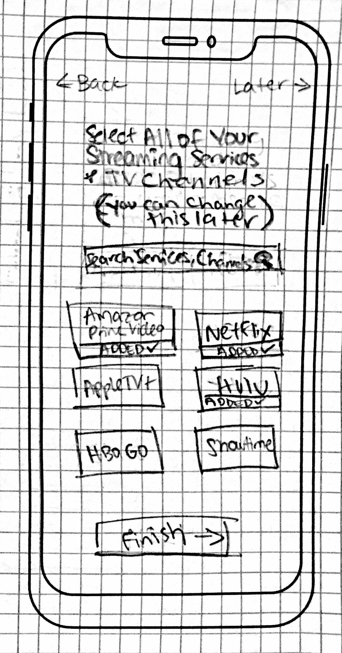
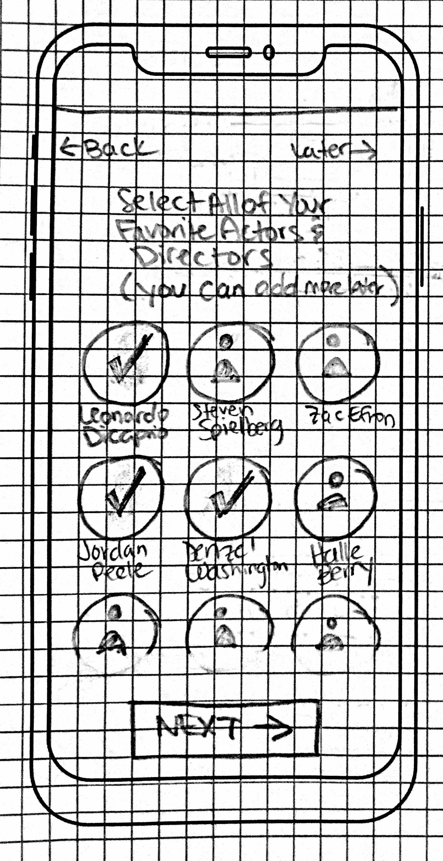
Paper Prototype:
We used the Task Flow to create the Paper Prototype. Each group member created their own prototype.
We ideated what we liked from each of them, which included:
Customizing their home screen, like a dashboard, by adding, deleting, and rearranging the categories to add more personalization for the user, thus making it easier for users to quickly choose what they want to watch.
Displaying the mood category on the search page, similar to a Spotify feature, due to the high ranking when card sorting.
A dedicated “Friends” bottom menu option due to the popularity of “word-of-mouth”, which is how most users decide what to watch.
Movie/TV and streaming platform labels for quick identification, which we discovered when doing competitive analysis on another app, which quickly lets the user know where the movie/tv show is streaming
Low-Fidelity Prototype & Testing:
We prototyped using Adobe XD.
Key findings from the user testing of the low-fidelity prototype included:
All of the users struggled with customizing the home screen, they had difficulty adding & moving categories.
A user did not like the word “Save” in the bottom menu as it confused them, they thought “watchlist” was more appropriate.
A user said that the search could be faster and thought the task they were given was not reflective of the average user
High-Fidelity Prototype & Testing:
We took into consideration all of the user feedback and iterations from the Low-Fidelity Prototype. We then applied the UI Style Guide and created the High-Fidelity Prototype.
Key findings from the user testing of the high-fidelity prototype included:
Users were able to successfully and easily complete all tasks
Users thought the app was easy-to-use
Key Takeaways
Streaming will continue to grow
There is a need for a better solution than what is currently on the market
We are not the user… yet?
Future Opportunities
More usability testing would always be welcome
Having a playlist feature would be useful